From Frustration to “Aha!”: Mastering the User Journey with Real-World UX Examples
Have you ever abandoned a shopping cart online because the checkout process was a nightmare? Or deleted an app five minutes after downloading it because you couldn’t figure out how it worked?
These moments of friction aren’t just minor annoyances. They are critical failures in the user experience, and they cost businesses time, money, and customer loyalty.
But how do you identify these problems before they happen? How do you design a product or service that feels intuitive, seamless, and even delightful?
The answer lies in a powerful tool in the UX designer’s toolkit: the User Journey Map.
This guide will demystify the user journey, breaking down what it is, why it’s a non-negotiable part of the design process, and most importantly, showing you three detailed, real-world user journey examples you can learn from.
What is a User Journey Map (and Why Should You Care)?
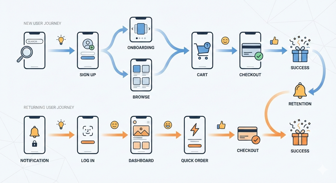
At its core, a User Journey Map is a visualization of the process that a person goes through to accomplish a goal. It’s a story told from the user’s perspective, detailing their interactions with a product, service, or brand across multiple channels and over time.
Think of it as a roadmap. A roadmap doesn’t just show you the destination; it shows you the entire route—the highways, the traffic jams, the scenic detours, and the rest stops. A user journey map does the same for your customer’s experience.
It typically includes key elements like:
- User Actions: What the user is doing at each stage.
- Thoughts & Feelings: What the user is thinking and how they feel (often visualized as an emotional curve).
- Touchpoints: The specific points of interaction with your product or service (e.g., website, app, email, customer support).
- Pain Points: The moments of frustration, confusion, or difficulty.
- Opportunities: The “Aha!” moments or areas where you can improve the experience.

Why is this so important?
- It Builds Empathy: A journey map forces you and your team to step out of your own shoes and see the world from your user’s perspective. It transforms abstract data into a human story.
- It Identifies Gaps & Pain Points: It makes it painfully obvious where your product or service is failing your users. You can’t fix a problem you don’t know exists.
- It Creates a Shared Vision: A journey map is a single source of truth that can be shared across departments—from marketing and sales to design and engineering. It aligns everyone around the user’s needs.
- It Connects User Needs to Business Goals: By identifying opportunities for improvement, you can directly enhance the user experience in ways that drive key business metrics like conversion, retention, and satisfaction.
The Anatomy of a Great User Journey Map
Before we dive into the examples, let’s quickly look at the structure. Most journey maps are laid out in a table or grid format with these columns:
| Stage | User Actions | Thoughts & Feelings | Touchpoints | Pain Points | Opportunities |
|---|---|---|---|---|---|
| The high-level phase of the journey | What the user does | What the user thinks and feels | Where the interaction happens | What frustrates the user | How we can improve the experience |
Now, let’s see this in action.
User Journey Example 1: E-commerce – Buying a New Pair of Running Shoes
This is a classic example that nearly everyone can relate to. The goal is to move a user from initial awareness to a happy, repeat customer.
User Persona: Alex, a 28-year-old casual runner who wants to start jogging more seriously. He’s tech-savvy but not an expert on running gear.
| Stage | User Actions | Thoughts & Feelings | Touchpoints | Pain Points | Opportunities |
|---|---|---|---|---|---|
| Awareness | Sees an ad for a new running shoe on Instagram. Follows a link to the brand’s website. | “Wow, those shoes look cool. I should probably get a new pair.” 😊 Curious | Social Media Ad, Brand Website | The ad is generic and doesn’t speak to his need for a “beginner” shoe. | Create targeted ads for different user segments (e.g., “Starting your running journey?”). |
| Research | Googles “best running shoes for beginners.” Reads blog posts and watches YouTube reviews. | “There are so many options. I’m overwhelmed. What’s the difference between stability and neutral?” 😟 Overwhelmed | Google, Blog Posts, YouTube, Review Sites | The brand’s website has too much technical jargon. It’s hard to compare models. | Create a “Shoe Finder” quiz on the site. Use simple language and comparison tools. |
| Consideration | Returns to the brand’s website. Filters by shoe type. Reads customer reviews. | “Okay, this model seems good. The reviews are mostly positive. I hope it’s comfortable.” 🤔 Hopeful but Cautious | E-commerce Product Page, Customer Reviews | Product images don’t show the shoe from multiple angles. No information on durability. | Include 360-degree views, video testimonials, and a Q&A section on product pages. |
| Purchase | Adds the shoe to his cart. Proceeds to checkout. Enters shipping and payment info. | “Ugh, they’re asking for my phone number. Is this going to take long? What’s the return policy again?” 😟 Anxious | Shopping Cart, Checkout Page | The checkout process has too many steps. The return policy is buried in the footer. | Offer a guest checkout option. Display a clear, simple link to the return policy on the checkout page. |
| Post-Purchase | Receives a confirmation email. Gets shipping notifications. The package arrives. He tries on the shoes. | “Great, it shipped fast! The box is nice. Wow, they fit perfectly. I’m excited to go for a run.” 😄 Excited & Satisfied | Email, Physical Package, Product | No follow-up email with tips on how to care for the shoes or a training plan. | Send a post-purchase email with a “getting started” guide, care instructions, and a link to a community forum. |
User Journey Example 2: SaaS – Onboarding for a Project Management Tool
This journey focuses on a critical period for any software company: getting a new user to understand and adopt the product.
User Persona: Brenda, a 35-year-old project manager at a mid-sized company. She’s busy and needs a tool to help her team collaborate more effectively.

| Stage | User Actions | Thoughts & Feelings | Touchpoints | Pain Points | Opportunities |
|---|---|---|---|---|---|
| Discovery | Hears about the tool from a colleague. Visits the website to understand its features and pricing. | “This looks promising. It could solve our communication issues. Is it better than Asana or Trello?” 🤔 Investigative | Company Website, Pricing Page, Feature Comparison Page | The website is full of marketing buzzwords but lacks clear use-cases for her industry. | Create case studies and testimonials from similar companies. Use clear, benefit-oriented language. |
| Sign-up | Clicks “Start Free Trial.” Fills out the sign-up form. Verifies her email. | “Okay, that was easy enough. Let’s see what this thing can do.” 😐 Neutral | Sign-up Form, Verification Email | The free trial requires a credit card, which is a barrier. | Offer a no-credit-card-required trial to reduce friction. |
| Onboarding | Lands on the dashboard for the first time. Sees a blank slate with a few pop-up tips. | “Now what? This is overwhelming. I don’t have time to watch a 20-minute tutorial video.” 😩 Frustrated & Confused | App Dashboard, Tutorial Videos, Tooltips | The onboarding is passive and not tailored to her goal of setting up her first project. | Implement an interactive, step-by-step onboarding that guides her to create her first project and invite a team member. |
| First Use | Manages to create a project. Spends 15 minutes trying to figure out how to create task dependencies. Gives up and uses a workaround. | “This is harder than it should be. My team will never adopt this if I can’t even figure it out.” 😠 Frustrated | App Interface, Help/Documentation | The core feature she needs is buried in a sub-menu. The help documentation is hard to search. | Improve the information architecture. Add a contextual “Help” button that links directly to relevant articles. |
| Adoption / Renewal | Uses the tool sporadically. Receives an email that her trial is ending. She decides not to subscribe. | “It’s just not worth the hassle. We’ll stick with what we have.” 😞 Disappointed | Renewal Email, Billing Page | The company never reached out to see how her trial was going or offer help. | Implement a “customer success” outreach for trial users. Offer a personalized demo to answer questions and show value. |
User Journey Example 3: Service – Booking a Ride-Sharing Service
This example shows how a journey map can capture a blended physical and digital experience.
User Persona: Carlos, a 22-year-old student who relies on ride-sharing to get around the city.
| Stage | User Actions | Thoughts & Feelings | Touchpoints | Pain Points | Opportunities |
|---|---|---|---|---|---|
| Need a Ride | Finishes class. Opens the ride-sharing app to book a ride home. | “I hope there’s a car nearby. I need to get home to study.” 😟 Anxious | Mobile App | The app takes a long time to load his location. | Optimize app performance for faster location detection. |
| Booking | Enters his destination. Sees the price and ETA. Confirms the ride. | “Okay, 5 minutes away. That’s not bad. The price is a bit higher than last time.” 🤔 Accepting | Mobile App, GPS | The surge pricing notification is confusing and feels unfair. | Be more transparent about why surge pricing is happening (e.g., “High demand in your area due to a concert ending”). |
| Waiting | Watches the car’s icon move on the map. Gets a notification that the driver has arrived. | “He’s here! Wait… that’s not my car. Or is it?” 😕 Confused | Mobile App, In-app Notifications, Physical Car | The car’s make, model, and license plate are hard to see on the small screen. The car is a different color than shown. | Increase the size of the car details. Add a feature to “turn on my car’s lights” to help with identification. |
| In-Ride | Gets in the car. Confirms the driver’s name. The driver takes a different route due to traffic. | “Why is he going this way? This is going to take longer. I hope the app adjusts the fare.” 😟 Worried | Mobile App, Driver, Car Interior | The driver’s music is too loud. The car isn’t very clean. | Add a feature to set preferred route options in the app. Provide a more discreet way to report driver or vehicle issues. |
| Payment & Rating | The ride ends. The app automatically processes the payment. Carlos is prompted to rate the driver. | “Phew, I’m home. The ride was okay. I’ll leave 4 stars.” 😐 Neutral | Mobile App, Payment System | The prompt to add a tip is aggressive and makes him feel guilty if he doesn’t. | Make the tip screen less intrusive. Offer a “thank you” message regardless of whether a tip is left. |
How to Create Your Own User Journey Map
Ready to try it yourself? Here’s a simple, step-by-step process:
- Define Your Scope & Goal: What specific user journey are you mapping? What goal are they trying to achieve? (e.g., “A new user signing up for our newsletter.”)
- Gather User Research: This is the most critical step. Do not guess. Use data from user interviews, surveys, support tickets, analytics, and usability tests to understand your users’ real behaviors and motivations.
- Create a User Persona: Give your user a name, a backstory, and a goal. This makes the journey feel real and helps build empathy.
- List the Stages & Touchpoints: Brainstorm the high-level phases of the journey and all the places where the user interacts with your service.
- Flesh it Out: Fill in the details for each stage. Use sticky notes (physical or digital, like in Miro or Figma) so you can easily move things around. Focus on actions, thoughts, and feelings.
- Identify Pain Points & Opportunities: Look at the emotional curve you’ve created. Where are the low points? Those are your pain points. How can you smooth them out? Those are your opportunities.
- Share and Iterate: A user journey map is a living document. Share it with your team, get feedback, and refine it as you learn more about your users.
Final Thoughts
A user journey map is more than just a deliverable; it’s a mindset. It’s a commitment to putting the user at the center of everything you do. By understanding their story—their frustrations, their needs, and their “Aha!” moments—you can move from simply building features to crafting meaningful, memorable experiences that keep people coming back for more.
So, what are you waiting for? Pick a simple journey, grab some sticky notes, and start mapping. You might be surprised at what you discover.